Developing how your company describes and represents itself is a challenging and enlightening journey. You have to revisit long held assumptions and confront the reality of what your customers and the market value. I absolutely believe that you can only do this effectively with outside help.
I’ve jokingly likened this process to us morphing from Maurice Moss from the IT Crowd (fiendishly intelligent, dependable and ultra-nerdy) into Neo from the Matrix (futuristic, omnipotent manipulator of spacetime). I’ll let you be the judge of whether that’s an accurate summation but I wanted to share how we went about the transformation and what we learnt along the way.
In the beginning
Garry and I started Cronofy to build a missing part of the Internet, the infrastructure for managing time. Whilst other companies focused on nice UIs for simple booking flows, we knew that to truly fix scheduling we had to look under the surface. The problems were very much not skin deep.
All scheduling happens as part of a workflow. Be that a job application, a sales process, a medical investigation or innumerate other examples, we’re always scheduling in the context of something. Any scheduling we do, therefore, must retain that context so that we can continue with our work without interruption.
When an interview time is selected by a candidate, the recruiting software should be updated so that the interviewers have the correct feedback forms to hand; an account executive can plan their demo prep and the sales pipeline automatically reflects their activity so their manager can quickly understand how effectively they are performing; etc, etc.
In the business context this is further complicated by very often having to coordinate multiple people. Interviews are often conducted by panels, sales people need the support of sales engineers, success managers have to corral multiple stakeholders.
To truly support the scheduling demands of modern businesses an embedded solution is required that has been designed from the ground up to support the most complex, multi-person requirements. Alongside this it needs rich privacy & security controls to support the information security needs of the most careful businesses.
Neither of these core tenets can be retrofitted if this is to be delivered effectively. The infrastructure, and the business that runs it, has to be designed from the bottom up to cope with these demands. But, in delivering this you cannot sacrifice scale or performance. If you want the world’s most demanding companies to rely on your scheduling infrastructure embedded into their workflows, there is no room for mediocrity. You have to continuously commit and deliver.
Whilst we’ve achieved all of this from a product and service perspective it became increasingly apparent last year that we were a long way from people recognising this in the way we present ourselves.
Time for change
The catalyst for this was our participation in the Startup Core Strengths growth program. We’ve always spent time with our customers. But through the program we got to know them on a deeper level – really learning what drives them, what they want from a product like ours, and the language that they use to describe it. It became clear that our existing messaging was confusing people and misrepresenting Cronofy’s world-class capabilities.
We engaged Sara Gordon to bring her expertise to work with our customers, the team and the market to help us distill the essence of what makes Cronofy so valuable. Customers come to us to solve their complex, multi-person scheduling problems at scale, but they also need us to protect their data and always be working.
We spent a lot of time making sure that the messaging language was authentic to who Cronofy are. We’re terrible actors so we had to make sure that we weren’t trying to commit to language that didn’t feel natural. We evolved our principles to ensure that the way we communicate would authentically represent the way we operate.
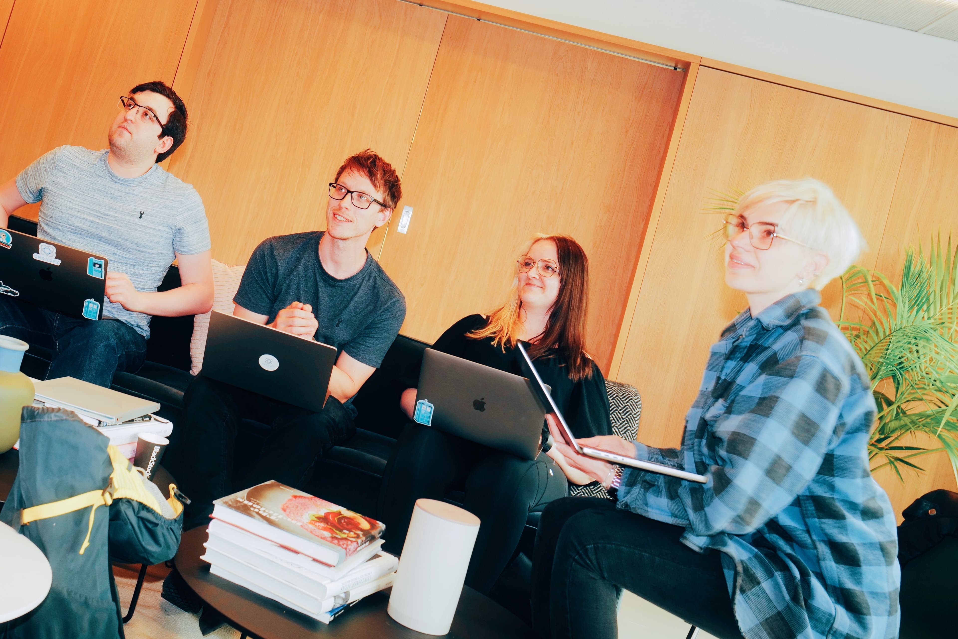
Collaborating around Miro boards, we revised and honed the language we were planning to use. The team were getting increasingly excited as this new, more confident, positioning and messaging started to become real.
But seeing our new voices in our old clothes didn’t feel right. There was an uncomfortable dissonance between the new language and the visual identity we were still utilising. We desperately needed an update.
Fortunately, already having a world-class service meant that we weren’t trying to put lipstick on a pig. Instead we had an incredibly capable swan dressed in dad-wear and it was time for it to put something else on.
Enter Philip Blaikie and Joe Kibria. Instead of engaging a design agency and sending them away to come back with a solution. We decided to work collaboratively and iteratively on finding a solution. A very Cronofy approach that afforded us two very important benefits.
Firstly Philip, Joe and Sara could help us understand and participate in the process and the reasons behind decisions as they were made. As a team we needed to fully embrace this new visual language.
We favour guidelines over rules and thus giving the team the context of decisions around colour choices, photography treatments, etc was going to be crucial to ensuring full adoption. Having a brand guardian sign off on every output would have been counter to everything we do.
Secondly, by being part of the process, we could quickly feedback on the authenticity of a design route for us. We are a straightforward, unblinkingly truthful company. Any visual representation we chose had to truly resonate with our principles for it to stick.
Back from the future
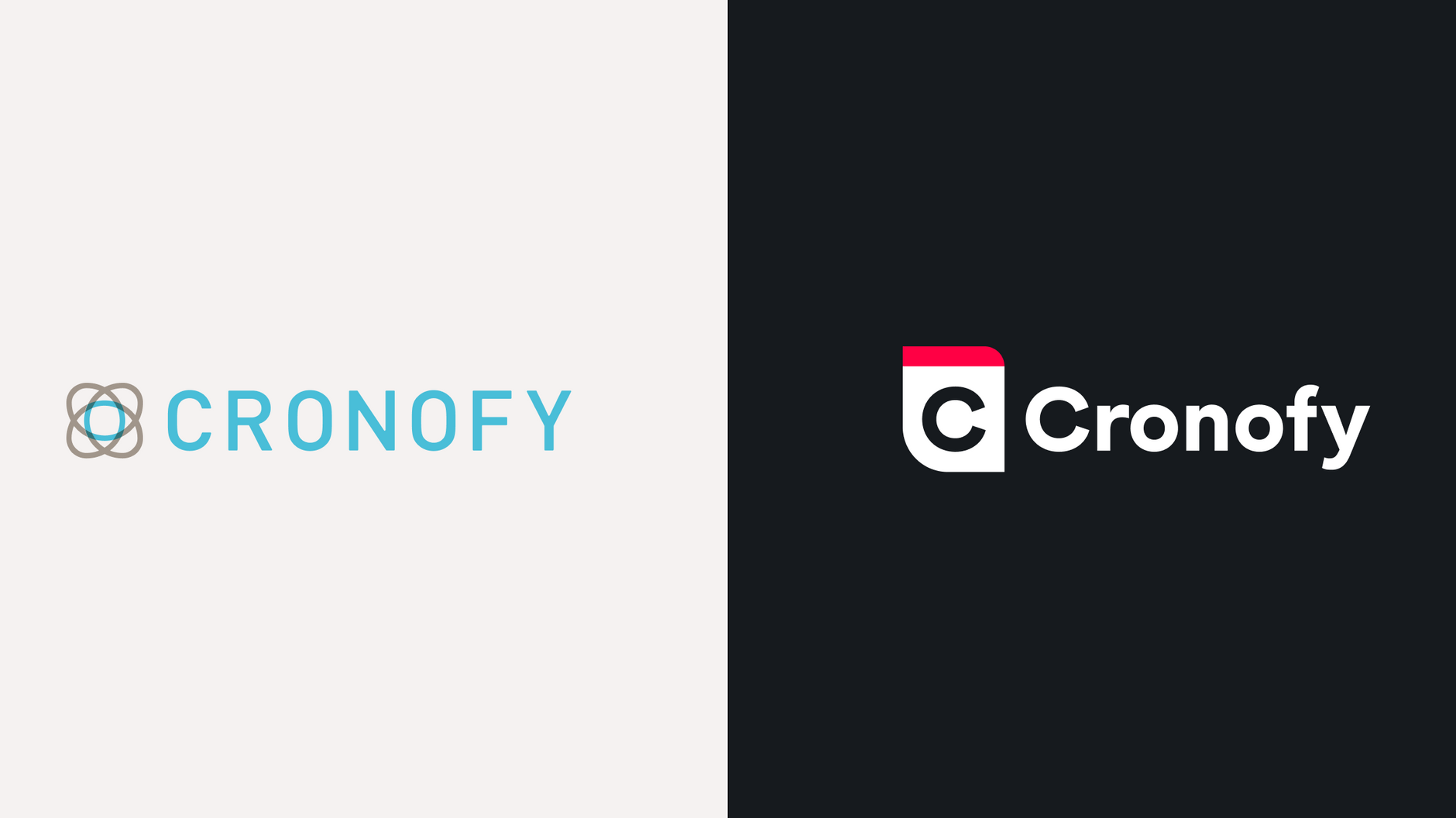
The result of this you can see around you. A new look Cronofy ready for our next chapter.
We’ve leant heavily on Swiss influences, the nation most renowned for accurate timekeeping, giving a minimal finish which prioritises performance over superfluous decoration.
Our colour palette is pared back to off-black and crisp white for superb clarity and accessibility. While accents of hot red speak to efficiency and our trailblazing spirit, but aren’t overused.
Typography is set in At Geodesic – a geometric humanist sans-serif by Arillatype with pleasing circular letterforms reminiscent of clock faces. It’s precise and confident with great readability in over 100 languages.
All topped with a brand mark that’s bold but straightforward and instantly points to what we do.
In true Cronofy style we’re releasing this incrementally. We update our service more than ten times a day so we apply the same approach to the deployment and evolution of our visual identity. We’ve released a simple reskin now, but you’ll also see updates to our use of photography and illustration styles which better represent the human aspects of what we do.
Arriving at this point in the way Cronofy presents itself to the outside world feels like an important milestone. Our customers knew, better than we did, the value they see from their ongoing relationship with us. Being so focused on the tech and the service meant that we’d been missing an opportunity to demonstrate to even more people how we could help.
The journey continues as we embrace all of the time challenges businesses face and become the go-to scheduling infrastructure for high performance companies globally.